The purpose of the A Plus Project was to select a letter of the alphabet and design four diverse images using different design principles. My teammates (Carla, Jennifer, Sami) and I designed and developed four ways to represent the letter “F.”
Design Process
We followed two main universal design principles including the Fibonacci Sequence and Color, which are based on Lidwell, Holden, & Butler (2003).
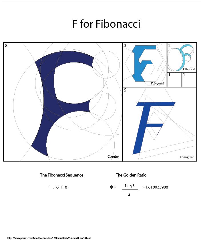
A Fibonacci Sequence (similar to the Golden Ratio principle) is a sequence of numbers in which each number is the sum of the two preceding numbers (e.g. 0, 1, 1, 2, 3, 5, 8, 13). Also, the division of any two adjacent numbers equals approximately 1.618. This number becomes more accurate and stable each time the sequence progresses. The Fibonacci Sequence’s trace is found in nature in many structures and patterns (e.g., flower petals, the distribution of galaxies, and hurricanes). We decided to use different geometrical shapes (circle, ellipse, triangle, and polygon) to create our letters instead of only the circle in order to show how applicable this principle is as well as to show our creativity.
The principle of color was also applied in our project design as it was used to represent meaning, enhance the visual aesthetics and organize the elements in our design. We selected the color blue because it tends to be a clean and calming tone, but the darker tones also project authority. It’s a color that seems to be universally favored in design.
We used Adobe Illustrator to create our design. After creating the four images separately, we compiled them all in one quadrant that represents the Golden Ratio. The design processes we each followed are listed below the image.
Circular (Sami)
As a result of its redundant existence in nature, I selected the circular shape to create the letter F. A number of copies of four circles sizes were used, which maintain the radius that match the Fibonacci Sequence. These copies were used to form the outline of the letter F by overlapping the circles and creating the letter from their intersections.
Triangular (Nadine)
My aim was to create a realistic letter F that has pointed edges, to highlight the triangle shape that was used to make it. I watched a YouTube tutorial video to learn how to make the golden ratio and see how I can apply it to letter F using triangles. I used triangles of different ratios to form the letter by overlapping them and then filled in the shape of the F with an aqua blue color. I left the lines to show the pattern of how I created it.
Elliptical (Jennifer)
A simple is best approach was taken with this version of the letter F. Using a limited number of ellipses, they were paired up to create the curves needed to form the letter, without having needless ones in the image. The appropriate areas were filled in with dark blue, as we agreed on a monochromatic color scheme.
Polygonal (Carla)
My objective was to create the letter F using various sizes of a polygon shape and overlapping them to form the shape of the letter. By using multiple polygons of different sizes, I was able to recreate the form of the letter F. I then filled in the shape of the letter using the color blue that we had agreed upon.
Design Challenges
The main challenge in terms of the design was the creation of the actual images for most of us. We had little to no prior experience with Adobe Illustrator and had to pick up the tools quickly in order to create the letter F with our respective shapes. Additionally, we did ruminate over the best way to display the four Fs as a cohesive unit that also clarified the theory behind it.
Collaboration Challenges
It can be difficult for everyone in a group to progress at the same pace, so that was the major collaborative challenge for us. While some picked up things more quickly, others required more guidance. However, we tried to scaffold each other’s learning to the best of our abilities.
Personal Reflection
I think that the most valuable lesson I got out of this experience is realizing how important the planning phase is when designing content as a group. I felt that we jumped into the idea very quickly without exploring other options or considering the challenges we would be faced with when creating our particular design based on the selected principle. I believe that if we had spent more time at the beginning to flesh out our vision and design, with would have been easier to represent our interpretation in a clearer way.
References
Lidwell, W., Holden, K., & Butler, J. (2003). Universal principles of design. Gloucester, MA: Rockport Publishers, Inc.
Philip Securities Indonesia. (n. d.). Sekilas tentang fibonacci dalam trading system. Retrieved from https://www.poems.co.id/htm/Freeducation/LPNewsletter/v39/news01_vol39.html